
Introduction (Feb 27, 2017).
Learning how to make high quality prints is an essential skill for photographers. I’m finding that, despite the availabilty of high quality printers and excellent software for calibrating, profiling and printing high resolution images, this skill is difficult to master (see the archive section below for my past history in trying to master this skill). It’s not so much that it’s difficult to make (technically) high quality prints, the challenge is in making prints that match the images that you see on the computer screen and to do this with confidence and predictability.
In this section, I’m hoping to document a workflow process that ensures that what you see on the computer is what you get on paper (within the limitations of each medium) and that the quality achieved is at the highest possible level.The components of this workflow that are critical consist of the following:
1. The workflow needs to be fully color-managed. That is, each component (display, printer, paper) must be calibrated to a specific standard which yields consistent color across all components.
2. High quality color display(s), color calibrated.
3. High quality printer(s) with custom profiles for each paper used.
4. Software workflow (Lightroom, Photoshop) that is flexible, accurate and consistent and has tools to optimize the “Look” of the image on print. Further that there is a facility (soft proofing) which allows for previewing the print output on the screen before committing to paper.

Phase 1. - Keep it simple.
In order to keep this simple, I’d like to start with a Lightroom-only workflow, and nothing fancy. I’m sure Photoshop will give me more flexibility but sticking with a single app for now will minimize the variables.
References:
https://photographylife.com/the-basics-of-monitor-calibration
http://retouchingacademy.com/the-hitchhikers-guide-to-getting-accurate-color-on-your-monitor/
Display profiling and calibration.
I have a dual display system - iMAC w/27” 5K retina display (late 2015) - 5120 X 2880.
NEC PA272W wide gamut display - 2560 X 1440.

Above is shown the differences in color gamut between the iMAC display (in white) and the NEC display (in color).
The iMAC display was calibrated with the i1 Display device (using i1Profiler software) as well as the i1 Pro2, yielding similar results
The NEC display was calibrated with it’s included calibration device and software (SpectraView) as well as with the i1 Pro2. Again, results were similar.
Despite this calibration, each display had a different “look”. The NEC display was noticeably “warmer” in color. The differences are likely due to different LCD technologies, different resolutions, slightly different luminance, etc. who knows. Since I picked the NEC display for all my color work. I’ll use that as my reference.
The profiles used for each display are:
iMAC 5K - i1Pro_2017_0226
NEC - PA272W_i1Pro_2017_0226
Printer custom profiles.
My printer is the Epson Stylus Pro 3880.
The printer has a “native” resolution of 360ppi
I made a couple of custom profiles using the i1pro2 device and software - i1Profiler. One was at the default d50 luminance, the other was based on a light reading at my desktop. The paper I used was Epson Exhibition Fiber. The profiles are:
Eps3880_i1Pro_50p_Dual_ExFbr_D50.icc (50 patches, dual pass)
Eps3880_i1Pro_50p_Dual_ExFbr.icc
I’ll explain the process of making these profiles later in this report. Here’s an introduction video for starters.
https://www.youtube.com/watch?v=nwofwdDNtNw
I also tested with Epson’s factory profile - Epson_SP3880_Exhibition_Fiber_Paper_v1
I printed a variety of images and, mostly, got similar results. The profile generated for “office” lighting was slightly warmer and more saturated when viewed in the office. The others were more accurate when viewed under daylight lighting. As expected. None of the profiles gave me the results I wanted. In some cases (maybe all) I felt there was a slight green tone in the print that wasn’t on the screen(PA272W). This especially was noticeable with skin tones and I had noticed that on other prints I had made previously. So, first pass, not entirely happy with the results but a good start.
Let me now explain the Lightroom workflow I used to generate the prints.
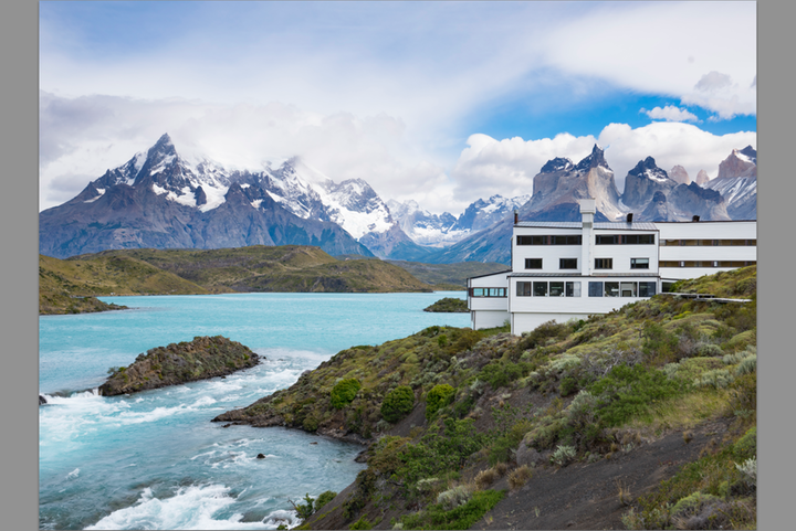
Start with an un-touched RAW image (DSC3370.ARW).

Make edits on a virtual copy. This becomes the “Master”. (DSC3370.ARW Copy 1-Master)
Here I cropped to an 8 X 10 format
While viewing this image in the Develop Module, check “Soft Proofing” and configure the Proof settings for the appropriate printer profile.
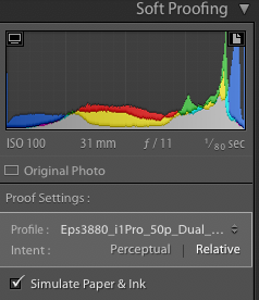
When prompted, make a new virtual copy of the soft-proofed version. (DSC3370.ARW Eps3880_i1Pro . . .etc.)
You can now compare the soft-proofed version to the Master using the compare feature of Lightroom (Y-Y).
Because the soft proofed version is simulating the printer + paper, it will generally be a bit washed out compared to the master. The objective is to make adjustments to make the soft proof version look like the master as viewed on the screen. This will generally require small adjustments to exposure, contrast and saturation (or vibrance). In the histogram you can also check for out-of-Gamut areas and make any corrections you feel required. I’ll deal with this later as things get more complex.
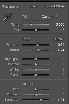
Here you see the adjustments I made.
The resulting comparison looked like this (Make sure you’re comparing the Soft proof to the Master):
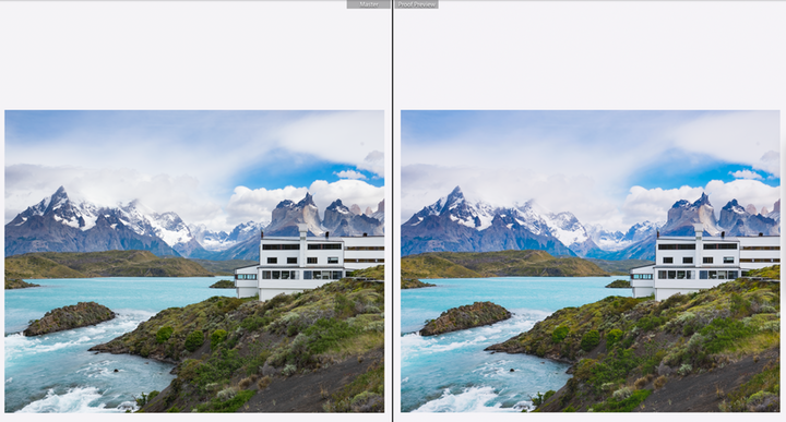
The images are too small to compare here but looked similar on the screen.
If we now print the soft proof version (I turned soft proofing off before printing but probably didn’t need to), theoretically we should get an identical image to the Master version because the soft proofing adjustments have compensated for the differences in medium, taking into account the printer profile, paper, etc.
The next step is to print the image using Lightroom’s print module. There’s a lot you can get wrong here so pay attention.
1. Press Page Setup (bottom left) to set the orientation and paper size for the targeted printer. For 8 X 10 prints, I usually use US letter - Borderless (retain size). This is the only way I can assure 8 X 10in exactly)
2. Cell size - 8X10, Print resolution - 360dpi, Print sharpening - Med, 16-bit output. Pick same rendering Intent as the soft preview (relative colormetric or perceptual).
2. Press Printer (bottom right) and configure the printer settings - good to put these in a preset. Make sure color management is turned off.
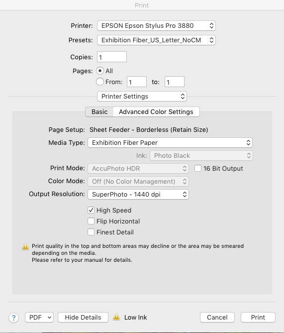
Put the paper in the printer and go ahead and print.
Compare the print (preferrably illuminated in d50 light) to the Master copy on the screen . The colors should match closely. More or less.
Note. As an additional step, I exported the profiled image to NIK Sharpener Pro 3 Output Sharpener. This creates a TIF file which you can sharpen for printing (inkjet). In this case I printed the TIF with the sharpening option on the Lightroom Print Module turned off.
Note. For future reference, here’s a good article on soft proofing
http://www.cambridgeincolour.com/tutorials/soft-proofing.htm
OK, end of Phase 1, now on to Phase 2.
Phase 2.
Objectives:
1. Calibrate the two monitors so the colors look the same and are as close as possible to the prints. Right now, the iMAC monitor looks closer and the NEC monitor continues to look “warmer”. It looks like there’s a way to match white points between monitors so I can try that (see the Spectraview manual). Also, I’d like to re-calibrate the NEC monitor with my new i1Pro2 device, using the Spectraview software, to see if that makes any difference. I also ordered a light box which should arrive soon. This will close the loop on comparing screen to print.
While both monitors, when calibrated to 65K, looked quite different (the NEC looking , to my eye, much redder and warmer than the iMac, when I measured the white point of each monitor, using the i1Pro2, they both measured the same.
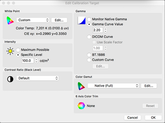
The GTI Lightbox arrived and I was able to evaluate prints in controlled lighting. To my surprise, the iMac matched the screen-print much more accurately (to my eye) than the NEC monitor. In googling the various literature, I concluded I needed to match the white points visually by adjusting the NEC monitor using the Spectraview software. I did this using the "edit target” menu and edited the White point until I got a visaul match between the iMac display and the NEC. I got the best match at 7201K, x=0.299, y=.335. I then recalibrated the NEC with these parameters and was able to get a reasonable (not perfect) match between the monitors.

I also downloaded the NEC “Multi-Profiler” software which lets you edit profiles in a number of ways.
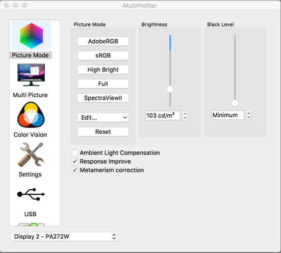
I had high hopes that the “Metamerism” option would fix some of the display differences but it made no effect that I could see.
It attempting to match the white points between the displays, here’s how the white point was changed on the NEC:
 I
I
It’s a bit disconcerting that the “premium” display (NEC) requires so much correction to match the prints. I think that at least some of this is how I’m perceiving the color. Carol sees it quite differently and argues that the 65K setting on the NEC is a good match to the iMac, and the prints. She sees my personalized white point as too green. So, the different spectral distribution of the colors, combined with some weirdness in my eyesight, is probably a contributing factor. Ultimately it’s me who is using this system so it needs to be calibrated for my eyes.
Note (Mar 12, 2017): after all this messing around with profiles, the resulting display profiles are:
iMAC - iMac_i1Pro_D65_03082017.icc
NEC - PA272W 4Y109409TW 2017-03-11 10-00 x=0.299 y=0.335 2.2
Both profiles were generated with the i1Pro2 device. I used i1Profiler for the MAC and Spectraview for the NEC. I measured and compared white points on both the iMac and the NEC using the i1Pro2 device. I confirmed that even when the measured white points are the same, the display colors look different (to my eye).
I have a lot to learn about using this software in conjunction with Spectraview but, initially, it was helpful in visually matching white points between the displays.
Note: I also calibrated the display at 7136K, again using visual matching of white points. This was also “close” but not perfect.
https://www.slrlounge.com/what-is-an-ips-monitor-understanding-ips-displays/
http://forum.luminous-landscape.com/index.php?topic=86133.0
Summary and next steps.
I made a number of prints using the workflow described above. In general I got consistent results when comparing the print (in the lightbox) to the screen(s). The iMac is still closer in color but the NEC is not a bad match with only subtle differences which mostly show up in skin tones (unfortunately). So, I’m feeling I now have a well calibrated system, at least for now. My only complaint is that I think the displays may be a bit low in luminance. They are set for 100cd/m2. I’d like to try 120 - 140 but assume this will require me to recalibrate. So I’ll leave that for another time.
Next is to make some prints focussing on skin tones. I need to get happy with the print results.
Profile the printer with different paper. Get confident in the process
Go to the next level with the i1Pro2. Not sure what that is yet but I’ll figure it out. Goal is to understand differences between the screen and the print
Do more skin-tone prints and try to understand how to improve the process (green cast issue)
Play with the Gamut warning stuff and how to correct.
Make some real prints I can frame.
Stay away from Photoshop, that’s Phase 3.
ARCHIVE
Color calibration using the ColorMunki
Display Calibration.
- Make sure screen is clean
- Set screen to default profile (Cinema HD)
- Follow instructions
- Do both left and right screens
- Visually check they look the same
Latest:
01/06/13
Thunderbolt Display_D65_010613
Note. User Profiles are located in michaelramsay/Library/ColorSync
Printing and Color Matching.
This is arguably the most complex step in any workflow that aims for high quality prints. There’s so many places to go wrong, I’ve learned that you have to create a “recipe” and stick to it, rigorously. Part of the complexity results from the fact that not all components (editing sw, print driver, printer) work correctly together and there are numerous forum posts that give you hacks to make things turn out the way you want them. You have to pay attention to all of this otherwise your prints come out looking bad and you have no idea what went wrong. In contrast, if you get it right, you can get consistent high quality prints that look identical across different outputs (Lightroom, Photoshop, Qimage). This is a great source of comfort after you have burned through dozens of expensive pages trying to get it right. Below I present my current recipe and workflow process. Deviate from this at your peril!
Components of Mike’s Printing Workflow.
Computer. MacPro, OSX 10.6.3 (for CS5, Lightroom), Parallels Vx.x (for Qimage)
Printers. Epson Stylus Pro 3880 (Default). Driver V6.60
Calibration. X-Rite Colormunki
Software. Adobe Photoshop CS5, Lightroom 3.0, Qimage Vx.x
Printing using Photoshop CS5.
Initial printer set-up.
- Turn printer On and let warm up for ~1hr
- Do a nozzle check to make sure nothing is clogged
- Check ink supply levels
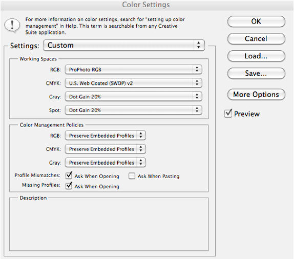
CS5 Color settings.
Check that CS5 is set up with the correct color settings.
Edit -> Color Settings
Set up Proof Colors.
View -> Proof Setup

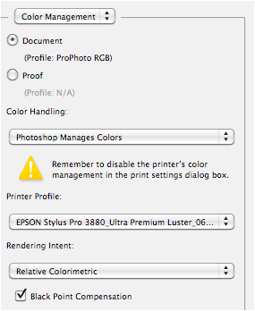
Pick the color profile you will be using to print the image.
Epson Stylus Pro 3880_Ultra Premium Luster_061610.icc
View -> Proof Colors
This will change the colors to give a representation of what the print output will look like. I generally like to check the “Simulate Paper Color” option since this gives me the best representation of what the print will look like.
You may want to make some last minute tweaks to the brightness and contrast to make the picture look good. In general, printed images will look a little dark and flat under normal lighting compared to the image on the screen. The Proof Colors view gives you a view on how to balance this out. In general, brightness adj ~+25, Contrast ~+10, Saturation ~+5, brings the image back to the “un-proofed” level. Don’t save yet since these adjustments are specific to the 3880 and it’s associated print profile. The source file is still the “Master” copy.
Note also that proofing could be done after resizing. I’m not sure it makes much difference.
The following is now specific to the 3880 Printer.
Set Image Size.
Re-size image to desired print dimensions and dpi
Example, 8” X 10”, 300dpi
Apply Output Sharpening as needed.
Note: Right now (6/20/10), CS5 has no good output sharpening solution in 64-bit mode. This is a bit of a limitation.
Save Image as a TIFF to a “Epson 3880 Print” Folder (for images to be printed specifically to the 3880 - proof adjusted for specific paper, re-sized and sharpened)
Printer Page Setup & Print
File -> Print . . .

Print Settings for Epson Ultra Premium Luster paper, 8.5” X 11”.

Print Settings for 1440 dpi, High speed off

Make sure that color management is correct.
In this example we use the recommended profile for this paper.
Epson Stylus Pro 3880_Ultra Premium Luster_061610.icc
Print, and enjoy.
Printing Using Lightroom 3.0 / 4.0
Today, Lightroom represents the best integrated workflow application out there. You can go all the way from ingestion to print without ever leaving it, or at least round-tripping seamlessly. There is little benefit in printing from Photoshop when you can print from Lightroom (except for soft-proofing). The output looks identical so I am assuming they both use the same print engine. Further, because Lightroom can work with external apps and plug-ins, it doesn’t suffer from the “64-bit compatibility” problem of CS5.
Lightroom factors.
- Lightroom does not require assigning a color space at ingestion. However, on export it will apply a color space. The preferred color space is ProPhoto RGB since this gives the widest color gambit.
- Lightroom works (non-destructively) on the native resolution of the images. Image size (inches) and dpi, are only assigned at Print.
- Unfortunately, there is no soft-proofing in Lightroom so it is hard to really judge what a printed output will look like. This is one reason why you might want to print from CS5.
Step 1. Once all editing steps are completed, export a TIFF file as a “Master”. This will be the master copy used for all print and display needs. Rename if desired and put into a collection called “Masters”. Alternatively, you may have a collection of “Picks” for a particular project which contain a mixture of RAW, TIFF and Jpeg images, from different cameras. If this is the case there is no need to export separate “master” images. Just continue to step #2.
Step 2. Everything from this point on is printer-specific. First, apply output sharpening. In the Develop Module, go to Photo -> Edit in . . . -> Sharpener Pro 3.0 Output sharpen. Choose “Copy with Lightroom Adjustments”. Apply the appropriate selections (use presets for commonly used settings). The image will probably look over-sharpened. This is OK. Save the image and return to Lightroom. The image should be in the library with the suffix “edit”. Rename as desired and put into a Collection specific to the printer assigned. ex. “Epson 3880 Print Masters”.
Step 3. Select “Print” in Lightroom. Select File -> Page set-up to select the paper and orientation desired. Select File -> Print Settings to check that the correct printer and settings are selected (No color management!). These setting should be the same as the ones shown above under CS5 Printing.
Step 4, on the right hand side menu area, set the desired size of the print.

Step 5. Select the options for the print job.

Note that Print Sharpening is un-checked since we already sharpened the image in Sharpener Pro. Also, make sure you have selected the correct print profile and Rendering intent.
Print and enjoy! The subsequent print should look identical to the CS5 print, except, possibly for differences in sharpening settings.
Note that this is not the highest quality setting but is good for speed.
Update: 01/06/13
Created a new profile - EPSON Stylus Pro 3880_Eps_Premium_Luster_1440_NoCM_010613
Prints came out a bit dark - in the print module, set Brightness to +25 and contrast to +10. Got slight improvement. Also, it may be that the display brightness is set to "Automatic". Will check
-----------------------------------------------------------------------------------------------------------------------------------------------
Creating Printer Profiles Using ColorMunki.
- Print target(s) from the ColorMunki application (2-step process, see on-screen instructions)
- Scan the targets:
Apply light pressure
Start & finish with the lens in the white space
Don’t move away from end of target before releasing the button
Latest:
05/23/2010
Use EPSON Epson Stylus Pro 3880_Epson Premium Luster.icc
(note. This is not the latest profile but I had difficulty getting a better one. So this is it for now if you want to print from Photoshop or Lightroom. I will update when I generate a new profile)

Latest:
06/16/2010
It appears there are issues in creating custom profiles for the the 3880 / OSX 10.6.x / Photoshop / Lightroom. I may have had this problem in creating the last profiles, hence I reverted back to the older profile. For a background & workaround see -
http://www.luminous-landscape.com/tutorials/solving.shtml
http://www.luminous-landscape.com/tutorials/solving-update.shtml
And, a Technote from Adobe, specific to CS5 -
http://kb2.adobe.com/cps/834/cpsid_83497.html
When you use Colormunki, you print the target from inside the application (not CS5 or Lightroom) but I suspect you have the same problem (images too dark).
X-rite has a recommended process for printing the target, see -
http://www.xritephoto.com/ph_product_overview.aspx?ID=1115&Action=Support&SupportID=4662
For testing the profile, recommend using the test chart, available here -
http://www.outbackprint.com/printinginsights/pi048/essay.html
Also downloaded to /Media Library-01/Test Files/PrinterEvaluationimage_V002_ProPhoto.tif
With instructions on evaluation available here -
http://www.outbackprint.com/printinginsights/pi049/essay.html
Using the above instructions (X-rite), I created a new profile -
EPSON Stylus Pro 3880_Ultra Premium Luster_061610
Printed a couple of test pages and the colors looked great. Prints were a bit darker than the screen, but close.
Update June 20, 2011
Time for new profiles!
This time I am creating profiles for the following configuration:

Actually, I used the sheet feeder
Color matching set to:

The resulting profile is stored in /michaelramsay/library/colorsync/profiles/EPSON Stylus Pro 3880_Ultra Premium Luster_062011.icc
Update 03/08/2012:
New Profiles:
For Red River Paper:
68lb UltraPro Gloss
3880 print Preset: Eps3880_Glossy_1440_NoCM
Profile: EPSON 3880_RRP_68lb_Gloss_030812.icc
For Epson paper:
Epson Ultra Premium Luster
3880 Preset: Eps3880_PrLuster_1440_NoCM
Profile: EPSON 3880_Epson Ultra Premium Luster_030812
Update 1/06/13:
EPSON Stylus Pro 3880_Eps_Premium_Luster_1440_NoCM_010613
A note on printing panoramas
Red River makes panorama paper that is 13 X 38”. Perfect for panoramas. However there are complexities in dealing with this custom paper size in Lightroom / Photoshop with the Epson 3880.
1. The Epson only supports paper heights up to 37.5”
2. According to Red River, with OSX 10.6 and up, there are also other quirks:
a. Set paper width to 12.95”
b. Set paper height to 37”
c. Set margins to at least 0.2”
Set this up in a custom paper setting in the printer settings and you should be good to go. I named mine “Panorama"
Tested with 12" X 36” image size and dimensions came out correctly.
I used the Epson standard glossy profile but probably better to make my own.
Printer Calibration (Epson 3880 MacPro Parallels)
- Make sure printer is OFF when you start Parallels
- Switch on printer, connect to VIRTUAL MACHINE
- Run ColorMunki, PC version
- Follow same procedure as for MAC
Latest.
05/23/2010
Use Epson_3880_Ultra Premium_1440_2010_0523.icm
- Open Qimage
- Select profile
 7. Select print settings (under Print Setup -> Properties)

8. Print
------------------------------------------------------------------------------------
Making the Perfect 8 X 10 Print.
I’ve made plenty of prints, mostly 8 X 10 for my “wall”. I don’t do it frequently enough to have memorized the workflow so each time is a little different, with slightly different results. I figure that I need to perfect this process to get more consistent results and make it repeatable. 8 X 10 is a convenient size because it shows the quality of the camera and printer without spending an arm and leg on paper. The “checkpoints” in the process include:
- Start with a “technically” correct image (in focus, correct exposure, etc.)
- Preferably calibrated with Passport or equiv. Min is a gray card
- RAW into Lightroom
- Minimal editing and clipping (calibration, white balance, minor adjustments)
- Correct (optimal) capture sharpening
- Export as a “Master”
- Make sure display, printer are calibrated (recently).
- After final adjustments for “paper” (Preview) apply correct output sharpening
- Export (save) as a “Print Master”
Printing dual-sided. (March 10, 2018)
I have a need to print on pre-scored paper in order to make a photo album. The paper is supplied by Pina Zangaro and is manufactured by MOAB. I’m testing 8.5” X 11” paper. The MOAB print profile is Lasal Photo Matte 235gm.
The paper looks like this:

For printing on the “front side" of the paper, you can use the normal settings for US Letter paper (I use borderless). Put the end of the paper w/o holes into the printer first. If, for example, you want to print an 8X10 with borderless printing, a .5” space will be left on the right side, .25” spaces will be left on the top & bottom, and a 1.25” space will be left on the left hand side to clear the holes. All good.
If you want to print on the reverse side (insert the edge with the holes first into the printer) it gets more complicated because the printer does not know about the scoring and the holes. The best way I found to do this is in Photoshop:
1. Export the image to be printed into photoshop.
2. Resize it to the desired dimensions (ex8X10, 360dpi) and save the file
3. Select all and copy the image to the clip board
4. Open a new file in Photoshop. set the image size to 8.5X11.75, 360dpi. This will also set the canvas size to the same dimension. Save this file
5. Paste the image on the clip board on to the background. Move the image so there is .5” border on the right and .25” border top & bottom.
6. In Photoshop, go to File -> Print -> Print Settings. Make sure landscape mode is checked

Under print settings, pick Presentation Matte backside preset. Check paper size is scored back-side (8.5X11.75). Go ahead & print.
For reference you can go to folder 2018 -> 2018_023_Marin_MOCA_Project -> DSC4203_Sized.tif for this example.
11X14 paper looks like this: